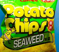
Just watched a Ted talk where the speaker believes our sense of artistic beauty results from a Darwinian adaption effect – and it got me thinking whether this applied to colors and more importantly, what about those green potato chips?
As kids, before knowing better, we used to search for those chips with green edges, prizing them as extra flavorful. Fortunately nobody turned green, but maybe this notion came from our natural appreciation for the color green.
The human eye has a higher sensitivity to green than to any other color. It’s the easiest on the eyes and soothing. Spend too much time in a grey city or a cold climate and then travel to a lush environment and notice how your eyes soak up the saturated green foliage. Green Christmas trees look extra welcoming during a snowy December.
Shades of green are usually up to some good. Not the florescent green of poorly maintained swimming pools but the desirable growth of plants. We have learned to trust green beans, peas, and paper money. Artists often mix their greens and so do chefs, but curiously, mixed green salads are not made of blues and yellows. Green is often used by designers to evoke trust, growth and nature. Pantone, the color matching authority, predicts this year’s new hue will be “honeysuckle,” which is a hot pink. I predict that its green complement is going to be more socially conscious and grab some limelight.
– So what do you think? What associations do you have with the color green?


